Stuart Haygarth, Categories

Stuart Haygarth is a 20th century artist and designer who in 2011 collected man-made items along the beach and arranged them in colour. He collected discarded objects and organised them to draw attention to the problem of pollution around England's shore for 500 miles from Gravesend to Landsend. Could you find out WHY he does that?
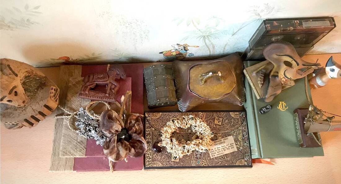
In this task, I attempted to do the same. Finding the objects was the easiest part of this attempt at copying Stuart Haygarth's Categories--I had many different items around me. Choosing a neutral background was also not hugely difficult. The lighting could be hard to work with because the objects cats many shadows upon each other. My layout is different from Haygarth's because his were lined in rows on a clean, white surface while mine were piled on top of each other. I did this because my objects were linked not only by colour scheme but also by family memories. It didn't feel correct to have them arranged by order when memories aren't clean-cut and clear. I plied them up a bit like how I found them so they still maintained there authenticity.
What links your objects, what was your reason behind the layout which is very different to Haygarths?
My Attempt-Task 1


Edited:
My Attempt-The Burning House Project by Robert Holden

Introduce the Burning House Project and Robert Holden's idea. Include images from the project.
The Burning House Project by Robert Holden is the idea where individuals gather the items they’d save in a fire. American photographer Robert Holden came up with an idea that documents the items most precious to individuals.
He said "It's a conflict between what's practical, valuable, and sentimental. What you would take with you reflects your interests, background, and priorities. Think of it as an interview condensed into one question."
Unedited- |
Edited-(am having trouble putting photo here)
|
|
|
www and ebi
I gathered my objects but had trouble with the layout and composition, it wasn't well presented and this made my photographs not look as nice as they could have been so I am unhappy with them.
Form Over Function

André Kertész, 'Fork', 1928
André Kertész created the image ‘Fork’ in 1928where he lived in Paris. There he mixed with artists from the Dada movement. His image is deliberately simple where he pays attention to the composition of the photograph. He emphasises the fork's geometry and form, it becomes more than a kitchen utensil or everyday object. Kertész said he believed photography should reveal the real nature of things. He expressed loneliness and feeling like an outsider through the subjects of his photographs, combining formal composition and emotive charge.
Henri Cartier Bresson said “Each time Kertész’s shutter clicks I hear his heart beating."
Analysis here
Henri Cartier Bresson said “Each time Kertész’s shutter clicks I hear his heart beating."
Analysis here
In this task I was required to respond to André Kertész's 'Fork' with my own photos.
A slide show or gallery of all images followed by best edits.
Best Edits:

I tried to pay quite a lot of attention to my composition, folding and bending the paper surface where my photos' subject lay which I think worked pretty well. During my editing, tweaking with the brightness, shadows, etc. caused the photo to have more of a contrast between the shadows and the forks. Many of my photos show background where there shouldn't be which disrupts my photographs but I figure that could be fixed with some cropping, despite this, it can be difficult to do so.
Lockdown Sequence
The aim of this task is to document the process of eating food using separate photos of the food each time a bite is taken or something is change.

|
|
WWW- I had a blank background so the photograph wasn't too busy.
EBI- My lighting wasn't very good and the apple jumped around too much so the photos look very different from each other.
EBI- My lighting wasn't very good and the apple jumped around too much so the photos look very different from each other.
Explain the aim for the piece below
The aim of the piece below was to document the process of the granola bar being eaten.
I erased the background so there was less of a potential busy background that would take away the focus from the subject but it doesn't seem to have worked that well. The edges of the bar seem almost cloudy and just blurred in general. I did manage to erase the background without erasing the subject though.
I erased the background so there was less of a potential busy background that would take away the focus from the subject but it doesn't seem to have worked that well. The edges of the bar seem almost cloudy and just blurred in general. I did manage to erase the background without erasing the subject though.


|
|
You need to edit the crisps into a Gif.
David Hockney- Photojoiners
David Hockney is connected to the Pop Art movement which is interested in responding to Popular Culture. One of Hockney's major aims is to be associated with the Cubist movement. The cubist movement refers to the artistic movement created by Pablo Picasso and Georges Braque which uses geometric shapes to create images of objects, people and places. He achieved this by taking photographs of the same subject from different perspectives and then collaging them together, sometimes in a grid and sometimes overlapping. Because the images are taken at slightly different times as well as perspectives, an illusion of distortion is created. Hockney realised this seemed to create a personal account of how someone sees the world and thus continued with this work from polaroid pictures to artistic narrative.
Well done Lorena, you clearly understand Hockney's intentions. Can you find the titles and dates of the images below.
Well done Lorena, you clearly understand Hockney's intentions. Can you find the titles and dates of the images below.

Pearblossom Highway, 18 April 1986
|

The Desk, 1 July 1984
|

David Hockney Noya and Bill Brandt with Self , 8 May 1982
|
My Response:
|
Object

Room

|
Person


|
You still need to annotate- www and ebi
WWW: My object --the rose-- worked quite well in terms of composition and responding to the task. It has even lighting as well and doesn't seem out of focus.
EBI: My photographs were either too bright or too dark in some cases and the room is very heavily distorted so some more clarity in its composition would benefit it.
EBI: My photographs were either too bright or too dark in some cases and the room is very heavily distorted so some more clarity in its composition would benefit it.
Light & Focus
Ute Barth
|
Uta Barth is a contemporary artist who takes photos related to perception and failure to see or be observant. Her use of light and shadow creates everyday, yet still abstract art that addresses scenes so familiar and yet never really noticed due to having long ago faded into the background. She brings attention to this to try and make people see differently and more in general. Barth has been taking photographs exclusively in her own house for 14 years. Barth says most photographers use the camera as a pointing device and that their images present the subject and content as the same thing. By that, she means that what the photographer focuses on is what they want the viewers to see. On the other hand, she wants to get people to "let go of thinking about wat's depicted" and instead have them interpret what they see in their own way. Her goal is to make them aware of their own perception and the way they see the world. Her personal experiences with her camera brought her to the conclusion that what she saw and what the camera saw where not one and the same, she was interpreting her surroundings differently. Barth considered this the camera showing her how to be more observant. |


|
My Response
In this task I was required to use the contrast of light and shadow to bring attention to my surroundings, subtle or not, and photograph my reply to Uta Barth's own photos.
Unedited:
Edited:

|

|

|

|
WWW: The subject I chose to photograph suited the theme as it showed themes of light and shadow achieved by a strong area of light and focusing on the shadows cast by that object. I found a harsh contrast between the light and my object's shadows so it stands out clearly and managed the exposure well so the photo was not too dark and underexposed or bright and overexposed, especially the latter considering the amount and brilliancy of the light that day. My images express my intentions to display a different side to everyday, familiar light and Ute Barth did herself but where she showed more subtle light, I decided to point out the more obvious shadows.
EBI: The concept didn't match Ute Barth the way I wanted them too. They're more colourful and busy than hers so maybe I could experiment with more muted, empty rooms. Her photos were all taken inside her house to I could try doing the same. To add on, I would also consider the composition in some of my photos strange, inconsistent and clashing with Bath's own.
EBI: The concept didn't match Ute Barth the way I wanted them too. They're more colourful and busy than hers so maybe I could experiment with more muted, empty rooms. Her photos were all taken inside her house to I could try doing the same. To add on, I would also consider the composition in some of my photos strange, inconsistent and clashing with Bath's own.
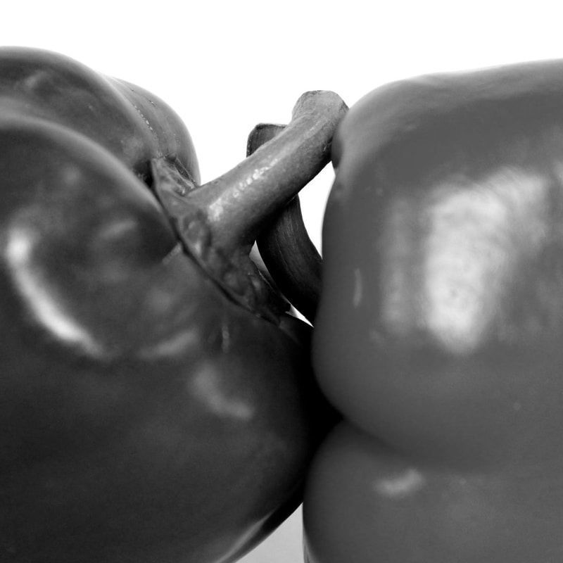
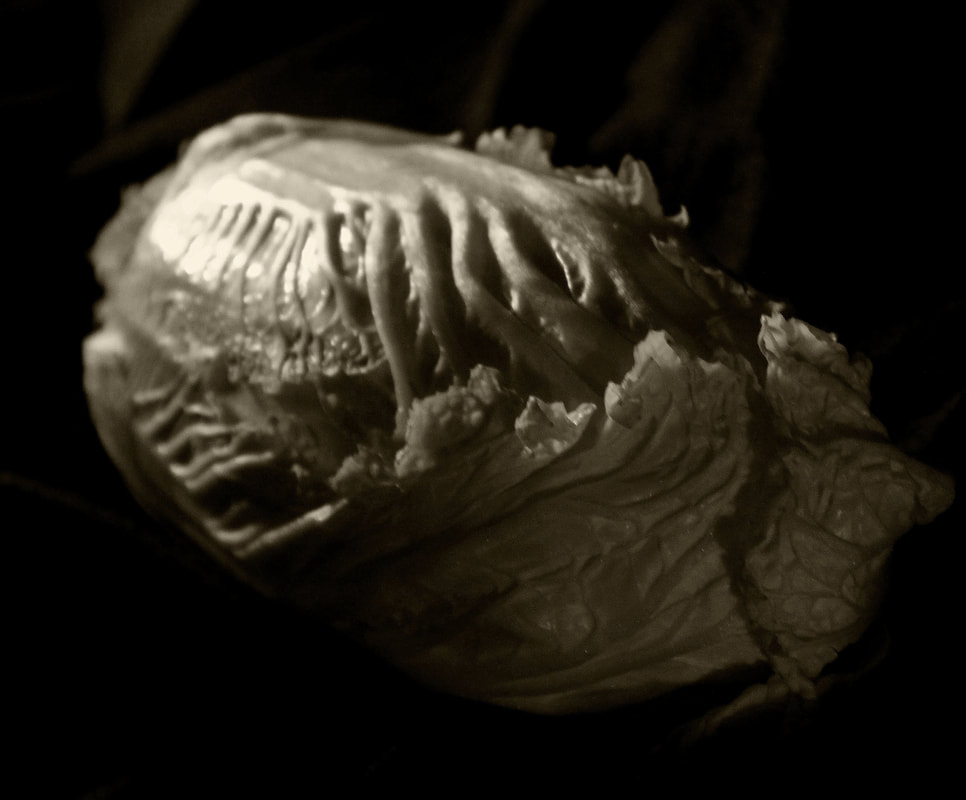
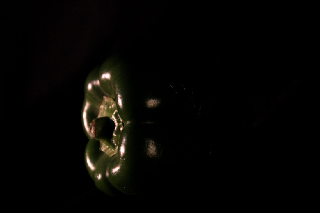
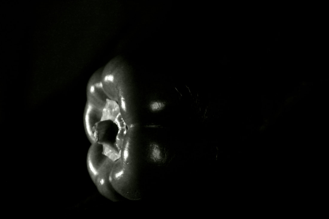
Ordinary to ExtraordinaryEdward WestonWeston used a Graflex: a type of camera which allowed him to see his subject matter in the right format before photographing. Weston had the philosophy that it had to be pleasing to him when photographing the peppers. He has been described as a master of composition with precise framing, showing his skills from not only talent but also experience.
During his time photographing the pepper a few issues appeared, such as lacking depth of field because the aperture was too big and light had trouble entering. Because the natural light had trouble entering, exposure could take anywhere from 4-6 hours which affected the image of Pepper no.30 (1930) in such a way that it was given a luminous appearance form the movement of light through those hours. |

|
My response: Natural Light
In this task I was required to respond to Edward Weston, particularly his project with the peppers and most famously Pepper No.30.
Best Edits

|
|

|

|
WWW: My range of edits gives a variety, the images don't seem too tightly cropped or crowded, and I like how the contrast of dark and light grey or green and red.
EBI: The photos could be more in focus and don't quite show a likeness to Weston's pepper.
EBI: The photos could be more in focus and don't quite show a likeness to Weston's pepper.
My Response: Artificial Light
This time I had to respond to Weston using artificial light. From my past experience with Weston's work, I learned how to balance my focus on the finer details without creating a blur. Because my camera was very close to the subjects, it made it easy for it to lose focus and sharpness. I knew to look for this issue and how to work around it.
Edited:
|
|
|
|
Both the pepper and the lettuce have two sets of images: one with more colour than the other but the pepper has a greater contrast in that regard than the lettuce which still has a tint of colour in both. I prefer the pepper's contrast to the lettuce's similarities and prefer the coloured pepper over the greyscale of the other. This is because I think the colours give it more depth and overall just create a more interesting look in general.
EBI: I think my composition is quite good; the subject is clearly shown without being cropped too tightly or favouring one side of the photo over the other. I also think that I controlled the lighting well enough for the pepper to show a likeness to Weston's pepper which contrasts against the dark of the background while also being contorted or changed by it.
WWW: My focus could have been better: the subject becomes more blurry at the edges than I intended and would have preferred and I think I would have liked it more if I'd edited the second lettuce photo to have more contrast.
How do the two sets of images differ? Which do you prefer?
Independent Development
In this task I had to choose a photographer to respond to in my spare time.
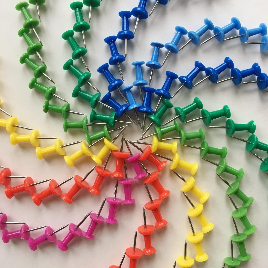
The photographer I chose was Adam Hillman who used everyday objects to form hypnotising patterns.
The photographer I chose was Adam Hillman who used everyday objects to form hypnotising patterns.
Adam Hillman
|

|
My Response
My idea was to stack and arrange coloured pencils, pins and coins to create various designs similar to Hillman's work.

Best Edits
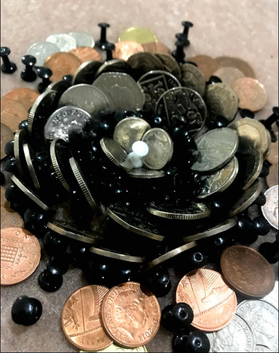

WWW: The subject I chose to photograph suited the subject matter because I also used everyday objects and arranged them to form patterns. I managed to achieve a nice contrast and my photographs showed my intentions on doing this quite clearly.
EBI: While I tried to match Hillman's work, his photographs were much more colourful than mine so to match the photographer I was responding to better, I could have used brighter colours and more vivid contrast. In my second of the best edit
EBI: While I tried to match Hillman's work, his photographs were much more colourful than mine so to match the photographer I was responding to better, I could have used brighter colours and more vivid contrast. In my second of the best edit
ANNOTATION SUPPORT
DO NOT DELETE: COPY AND PASTE SENTENCE STARTERS AS AND WHEN YOU NEED THEM
ANNOTATION
INTRODUCING A TASK
Subject matter
Subject matter
DO NOT DELETE: COPY AND PASTE SENTENCE STARTERS AS AND WHEN YOU NEED THEM
ANNOTATION
INTRODUCING A TASK
- In this task I was required to…..
- This task links to the theme as it shows....
Subject matter
- The subject I chose to photograph suited the theme as it……
- My composition helped to support my response to the theme by….
- I managed the exposure very well. My ISO / shutter speed / aperture settings were…..
- I prioritised my shutter speed to… (capture movement / blur/ frozen moment)
- I prioritised aperture to manipulate depth of field.
- I used a tripod to avoid camera shake.
- My images express my intentions which were…
Subject matter
- The subject I chose to photograph did not necessarily fit the brief
- The person / object / location was not interesting enough / appropriate / adequately lit…..
- My images do not show my intentions which were…
- The concept wasn’t clear in my images, I need to make it more explicit by…
- The location / time of day was not appropriate for the task.
- The compositions of my images did not show….
- I did not create enough depth of field / sense of movement.
- The image is overexposed / underexposed / too blurred.
- My images do not show my intentions which were…
- The concept wasn’t clear in my images, I need to make it more explicit by…
- Next time I will look at the work of (a photographer) to inspire a more accurate depiction of what I want to achieve.
- To improve my images I will experiment further with… (blur / shutter speed / composition)
- Next time I should use a tripod / use a different type of lens (be specific) / experiment with film…
